Skip to content
Sammie Kim
Dragon Copilot on a patient session, with the Settings panel open beside the session timeline.

Dragon Copilot for Physicians

Designing a scalable settings experience for Dragon Copilot, bringing configuration and personalization into a more clearer, cohesive interface.

Role
Product Designer
Duration
April 2024
Team
Dragon Copilot UX team
Focus
Visual design, Interaction design, Information architecture

01 — Context

Centralizing a growing settings ecosystem

As Dragon Copilot brought together existing dictation settings with new AI-driven capabilities, the settings experience needed a clearer way to organize an expanding range of preferences across platforms and screen sizes.

Learn more about Dragon Copilot(opens in a new tab)

02 — Solution overview

Organizing personalization around user needs

The redesigned experience established a more structured information architecture for settings spanning general preferences, style and formatting, dictation, library content, and profile configuration. Responsive patterns and clearer navigation created a foundation that could accomodate both existing preferences and future Dragon Copilot capabilities.
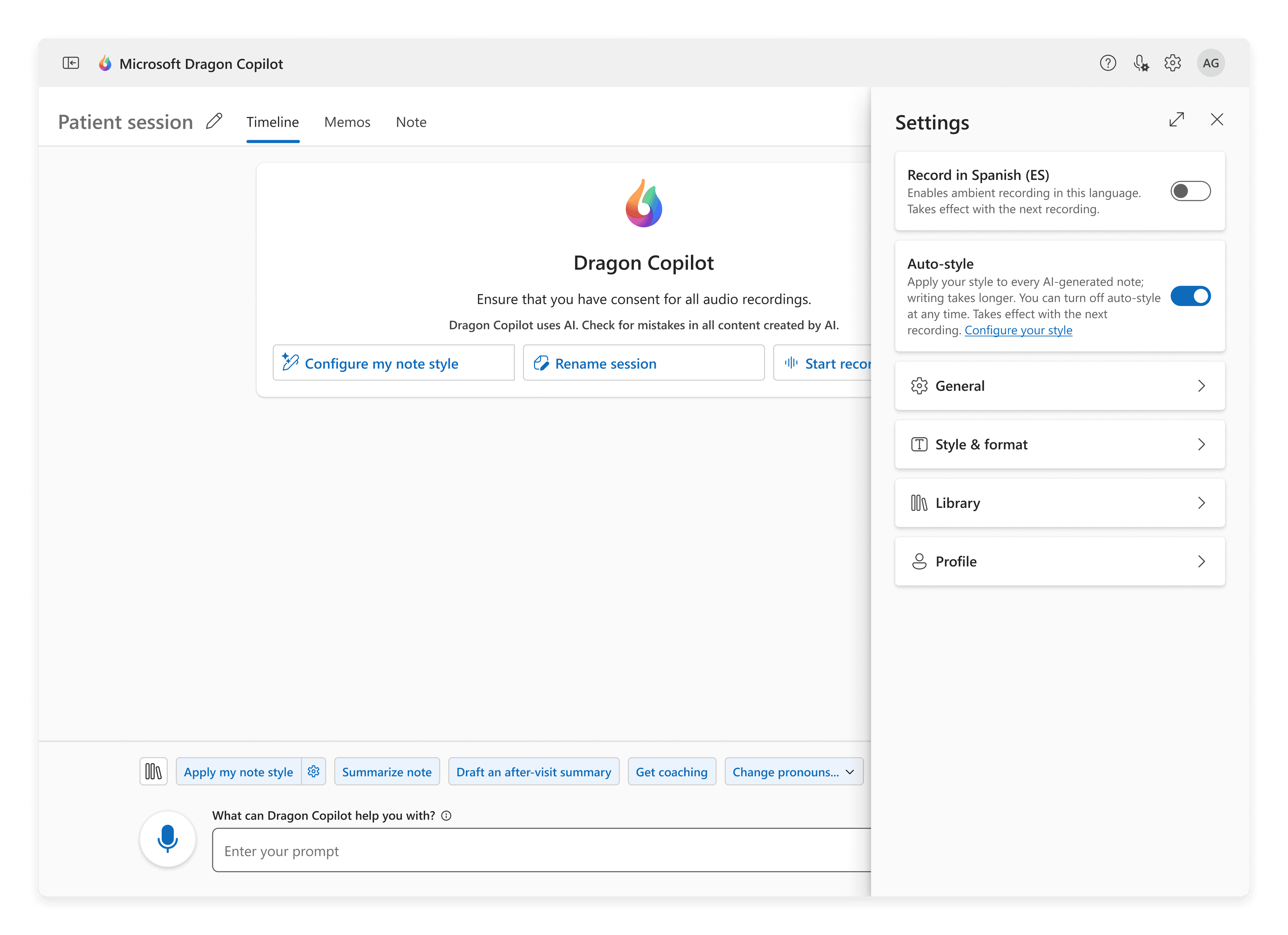
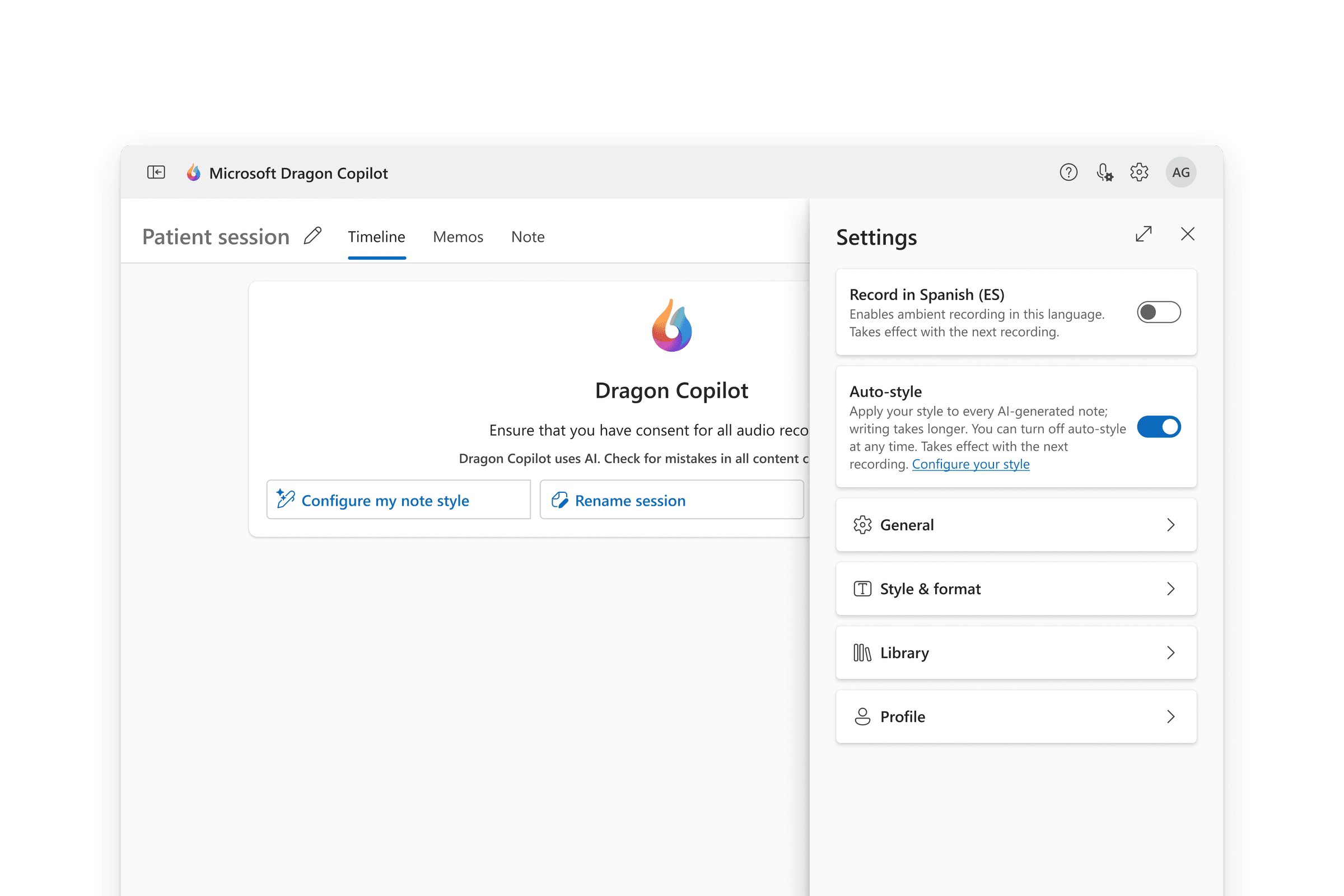
Dragon Copilot on a patient session, with the Settings panel open beside the session timeline. Settings lists a Spanish recording toggle, an Auto-style toggle, and General, Style & format, Library and Profile.
Settings opens in a drawer beside the patient session, so physicians can change preferences without leaving their work.
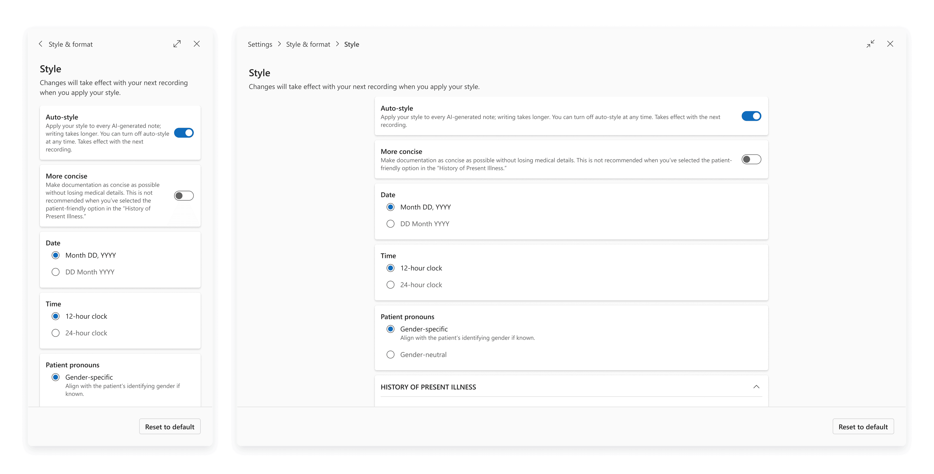
The Style settings page as an overlay drawer at two widths: a narrow panel on the left and an expanded full-width view with breadcrumbs on the right, both showing Auto-style, More concise, Date, Time and Patient pronouns options.
The Style page as an overlay drawer: a narrow panel by default, expandable to a full-width view with breadcrumbs.
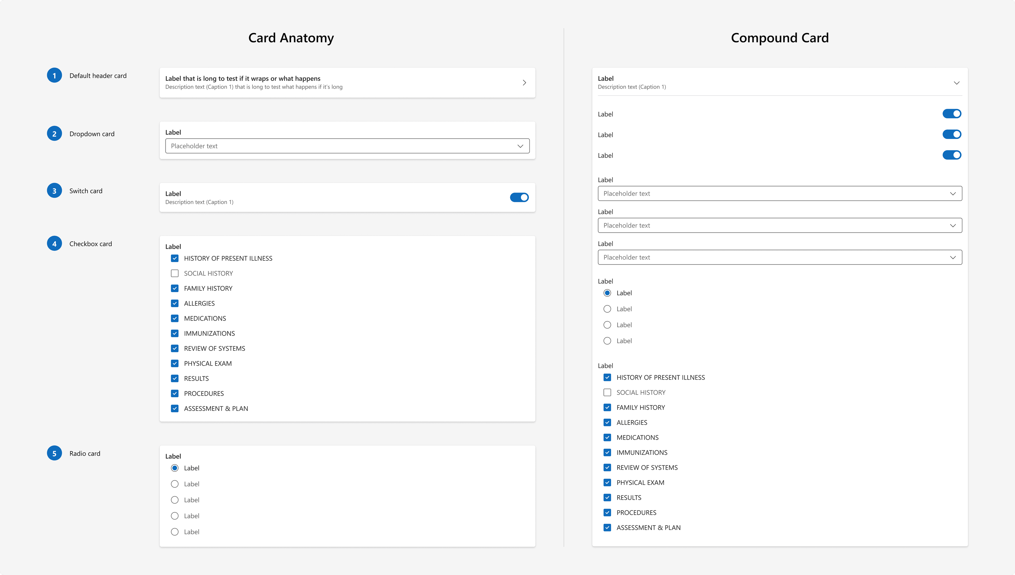
Component specs: Card Anatomy numbers five card types (default header, dropdown, switch, checkbox and radio), and Compound Card combines switches, dropdowns, radios and checkboxes in one card.
Card components for settings: five card types (header, dropdown, switch, checkbox and radio), and a compound card that combines them.

Full case study, including design decisions and process, available on request. sammiekim1227@gmail.com